![]()


Branding
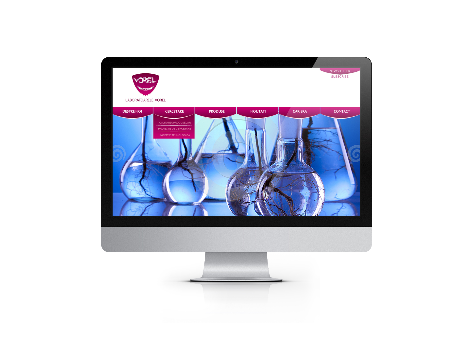
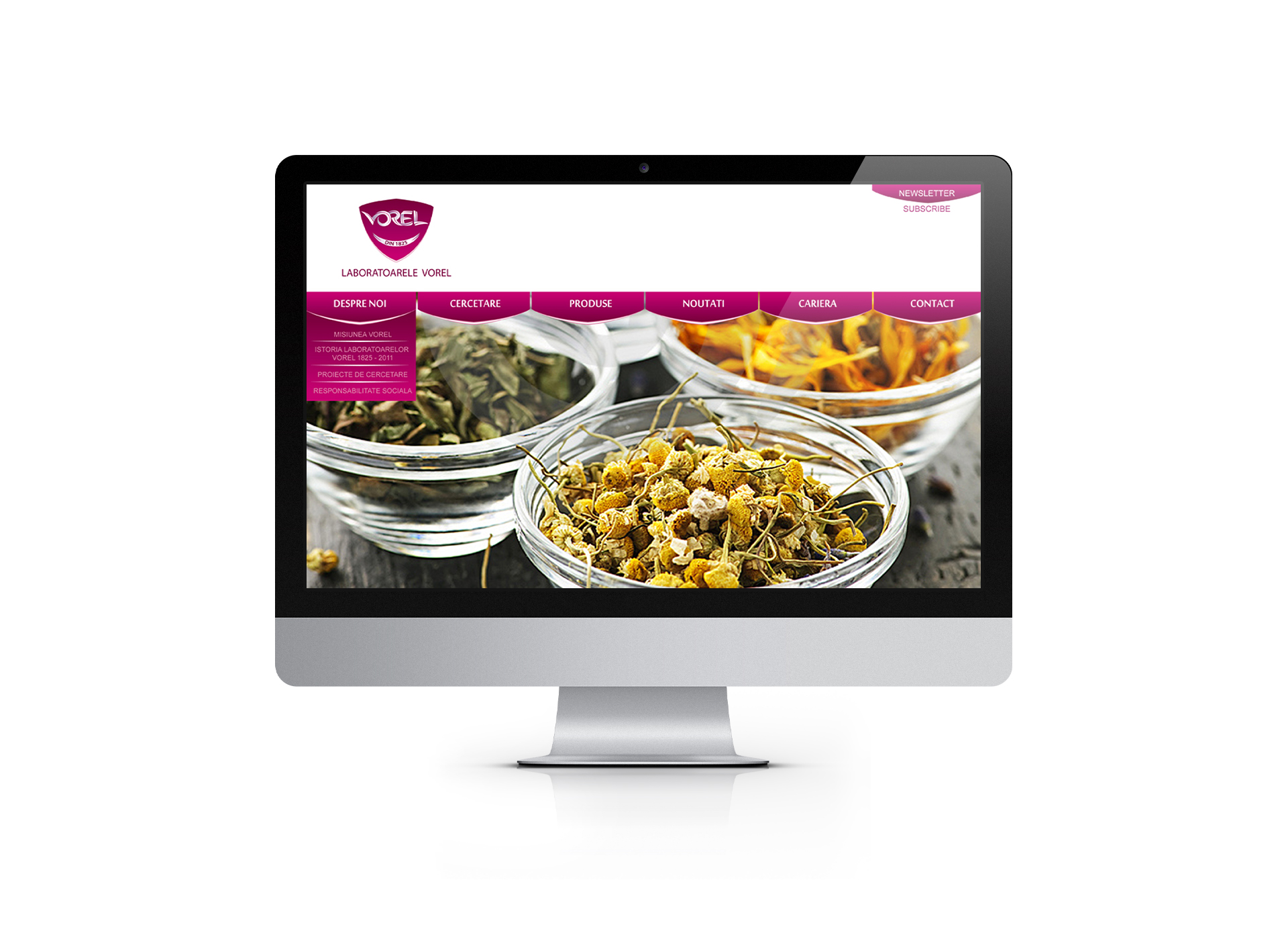
Laboratoarele Vorel
Descrierea Proiectului
Context
Compania Plantavorel are o traditie in producerea suplimentelor alimentare de la 1825, iar astazi apartine unor antreprenori romani si se bucura de reputatia unei companii romanesti cu istorie. In anul 1942 se produceau 120 de produse, distribuite in intreaga lume, sub marca Laboratoarelor Vorel, bucurandu-se totodata de prestigiul adus de titulatura “Funizor al Casei Regale”.
Provocare
In 2011 Plantavorel este ales “Cel mai promitator brand romanesc”, la prima editie a programului cu acelasi nume, beneficiind de expertiza Seed Consultants* in dezvoltarea unui program de branding customizat pe nevoile acestuia. Diversificarea portofoliului de produse, dezvoltarea jucatorilor din industria suplimentelor alimentare si intrarea pe piata romaneasca a unor competitori puternici la nivel international a determinat nevoia redefinirii brandului Plantavorel si dezvoltarea unei imagini diferentiatoare.
Abordare
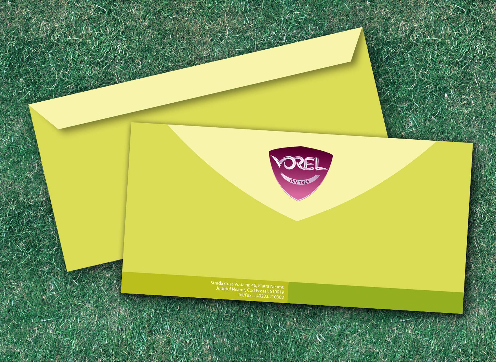
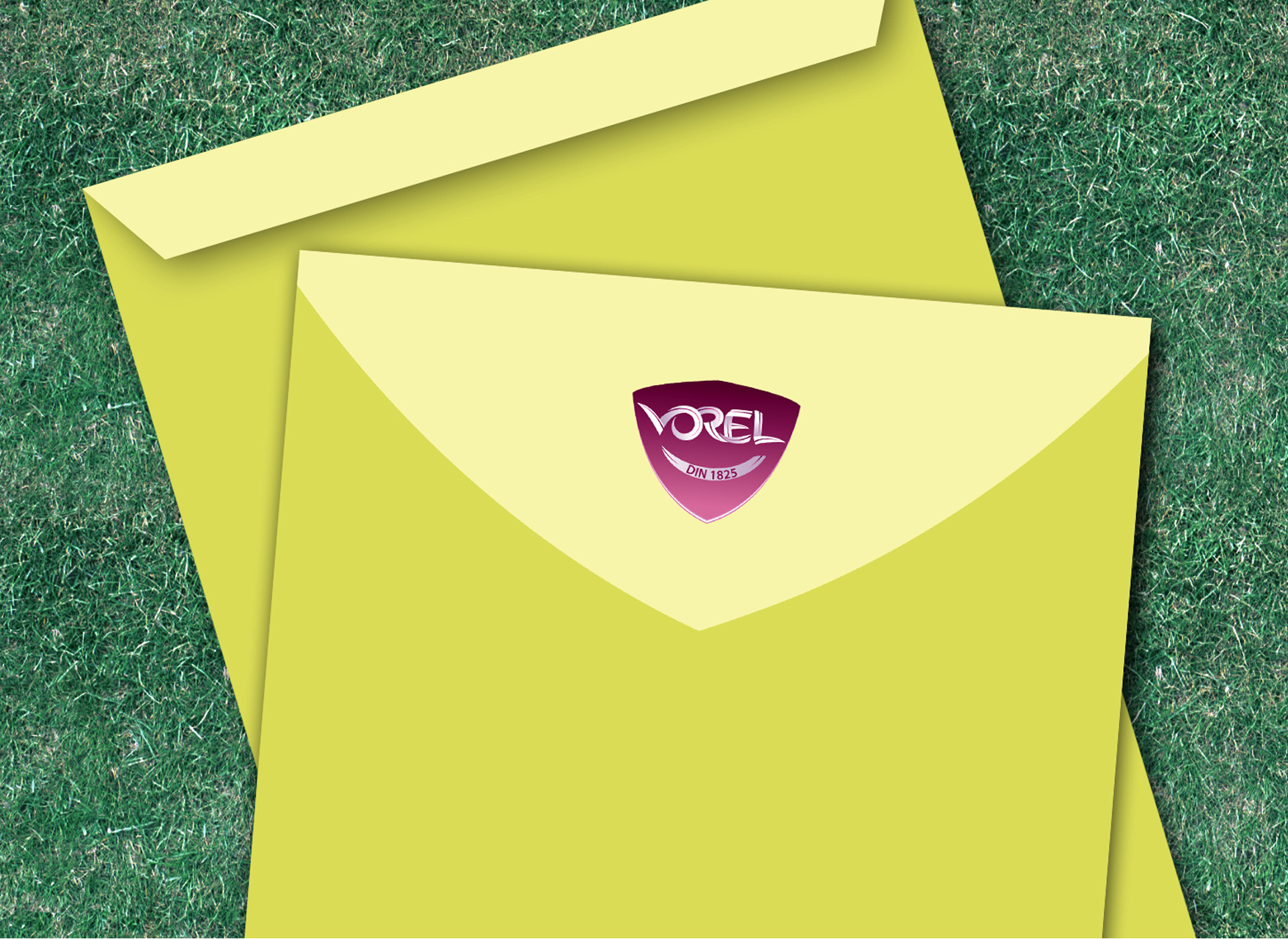
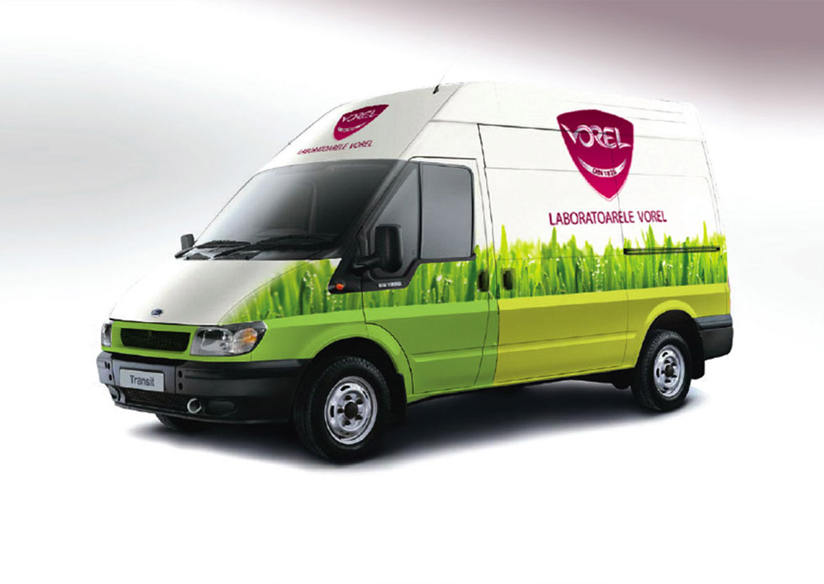
Primii pasi in definirea brandului au constat in derularea unui program de audit intern si extern printre stakeholderii importanti, a unor workshop-uri strategice si sesiuni creative cu reprezentantii top si middle management. In urma insight-urilor obtinute, consultantii Seed au elaborat strategia de brand aliniata nevoilor de dezvoltare ale companiei si consumatorilor moderni. In acest context, era necesara redefinirea imaginii companiei, astel incat sa insufle traditie si incredere, atat printre angajati, cat si printre parteneri si consumatori. In urma unor consultari cu echipa de management a fost luata decizia strategica de transformare a numelui brandului Plantavorel in Laboratoarele Vorel, continuand astfel traditia de la 1825 si impunand cele mai inalte standarde in fabricarea suplimentelor alimentare. Noul univers al Laboratoarelor Vorel este centrat pe o identitate vizuala proaspata, moderna si o tonalitate unica a mesajului si a graficii. Esenta brand-ului corporatist articuleaza misiunea companiei: aceea de a continua dezvoltarea tehnologica si diversificarea portofoliului de produse, vorbind despre cele mai eficiente combinatii de plante, vitamine, minerale si alte substante naturale de cea mai buna calitate. Conceptul identitatii vizuale porneste de la forma unui blazon care articuleaza practic intreaga constructie a logo-ului, declinand astfel simbolul protectiei, al sigurantei si al grijii pentru sanatatea consumatorilor. “Blazonul” reprezinta modul vizual prin care este redata atentia la detaliu, dezvoltarea continua a produselor si dorinta de a imbunatati starea de sanatate a consumatorilor Vorel. Logotipul este o readaptare contemporana, inovativa a unui font organic, redesenarea completa a literelor facand trimitere la potentialul nelimitat al naturii, pe care Laboratoarele Vorel il transforma in surse de energie pentru organismul uman. Unul dintre elementele moderne, diferentiatoare al noului brand il reprezinta folosirea unei nuante inchise a culorii rosu-violet, simbol al rafinamentului, dar si o culoare regala, impresionanta, nobila, care face trimitere la istoria insemnata a Laboratoarelor Vorel. Lansarea unei noi identitati si a unui teritoriu vizual al brandului reprezinta primul pas catre transformarea Laboratoarelelor Vorel intr-o companie moderna, inovatoare, dar in acelasi timp contribuie la revitalizarea unei traditii de aproape 190 de ani.
*Denumirea sub care a operat agentia noastra de branding in perioada 2007 – 2015 a fost Seed Consultants. Suntem mandri de radacinile noastre.